How to Create Simple Graphs in Canva: A Step-by-Step Guide ?
|
 Canva
|
Canva
|
0 months ago
|
11 Steps
Creating simple graphs in Canva is an intuitive way to visually represent data for presentations, reports, or social media content. With Canva’s drag-and-drop interface and built-in chart tools, you can easily design professional-looking graphs without needing advanced design skills. This step-by-step guide walks you through choosing a graph type—like bar, line, or pie—entering your data manually or importing it from a file, and customizing colors, labels, and fonts to match your style or branding. Whether you're summarizing statistics or presenting business metrics, Canva makes graph creation fast, accessible, and visually appealing, perfect for both beginners and experienced content creators.
How to Create Simple Graphs in Canva: A Step-by-Step Guide ?
|
Canva
|
11 Steps

1
Navigate to https://www.canva.com/
2
Click on the "Create"
Click Create a design in the top right.

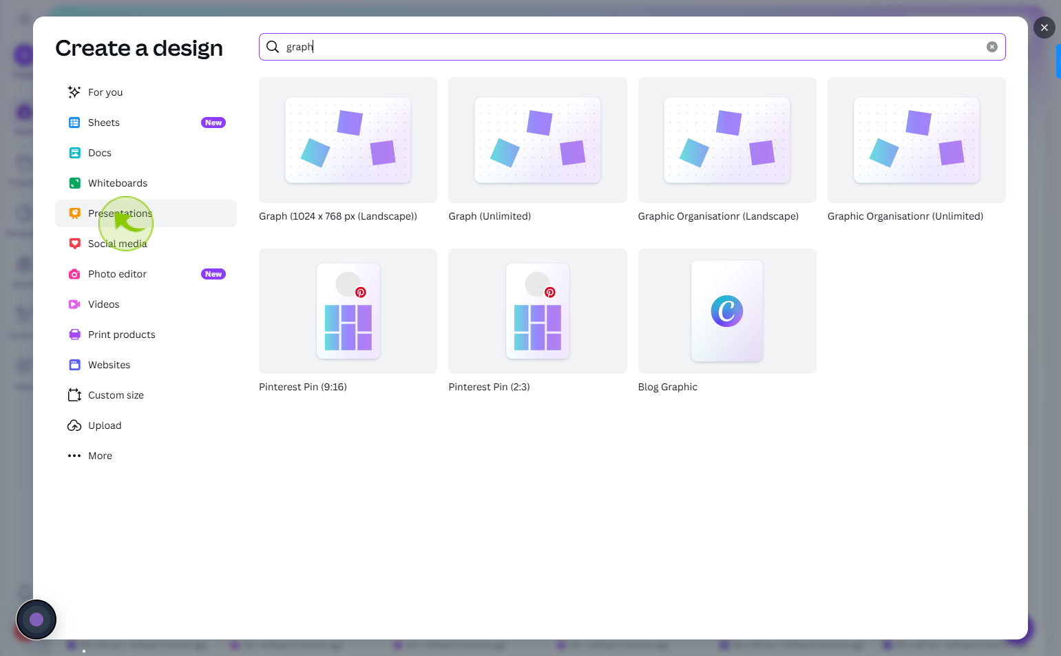
3
Click on the "Presentations"
Choose a template size, like Presentation, Infographic, or Custom Size.
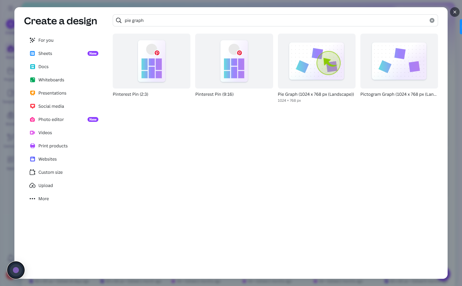
4
Click on the "Pie graph"
Select what you want
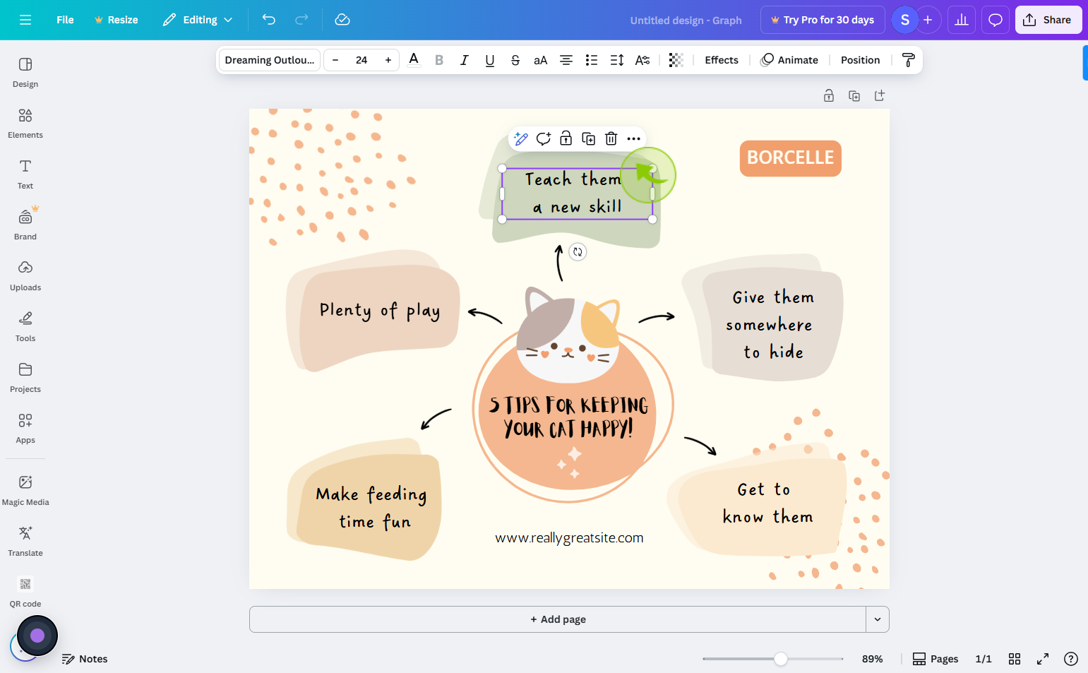
5
Click on the "Text"
you can add new things as of your choice
6
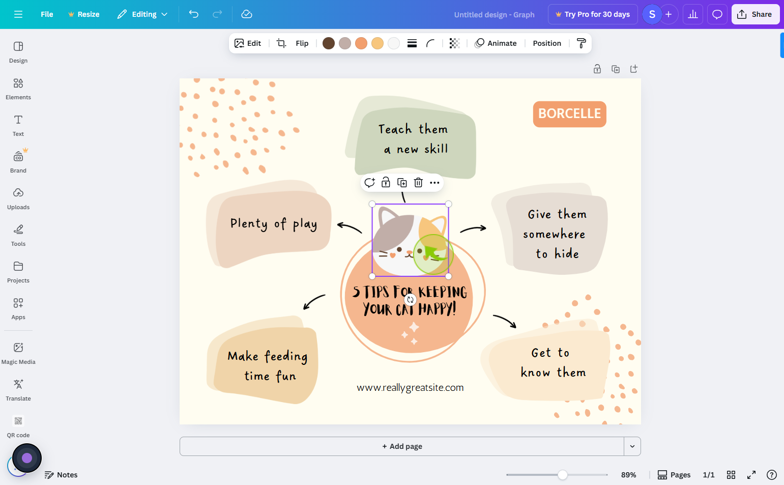
Click on the "Image"
You can change image
7
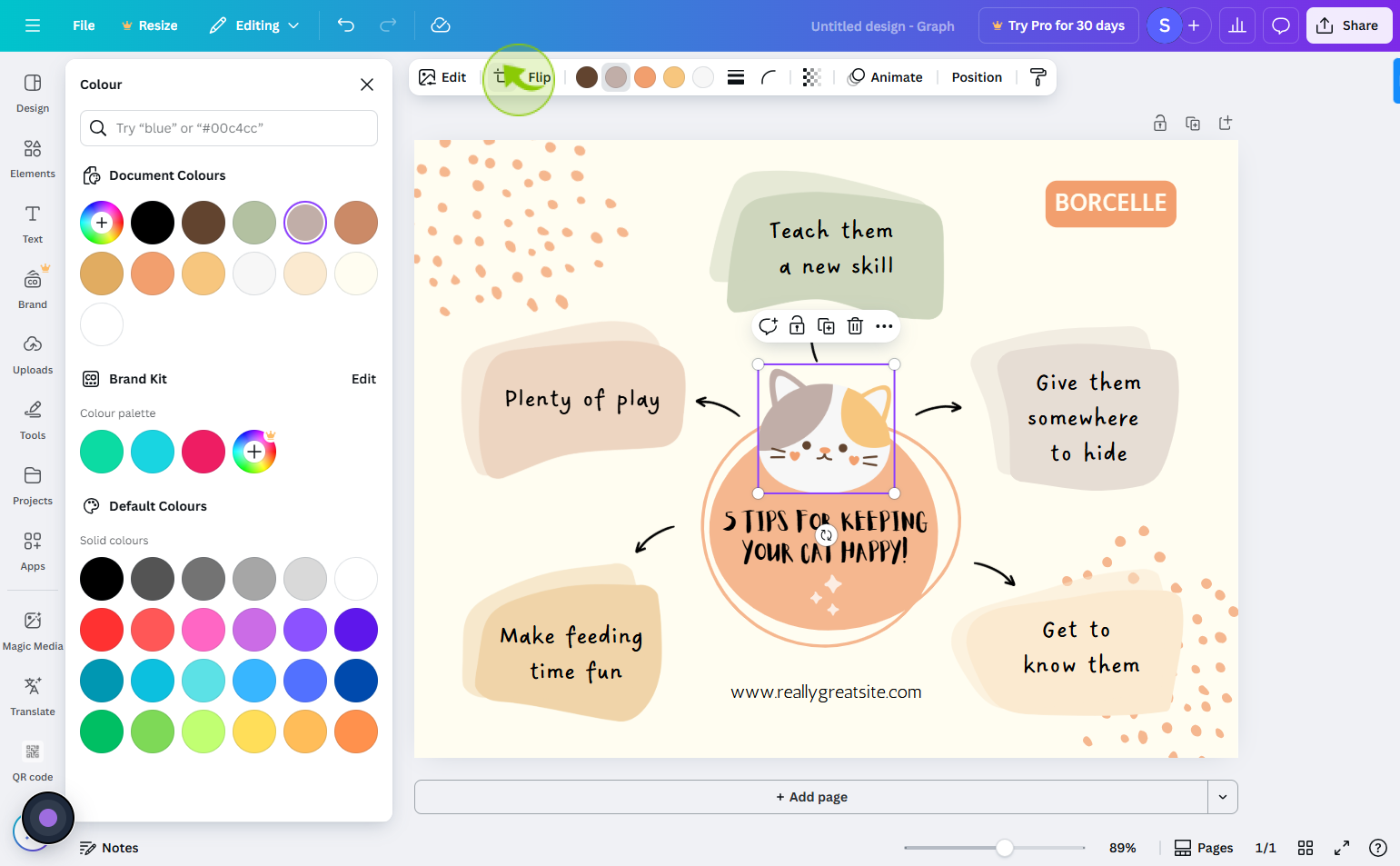
Click on the "Flip"
You can flip your images and other thing
8
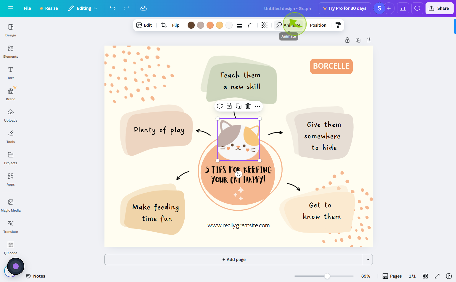
Click on the "Animate"
You can do animate your image or graph
9
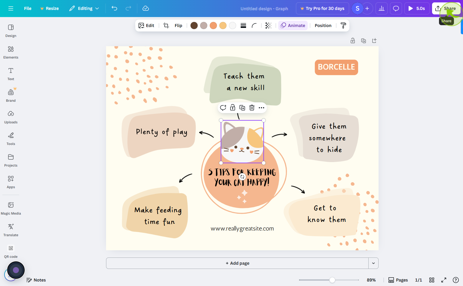
Click on the "Share"
You can share your image from the share icon on top right
10
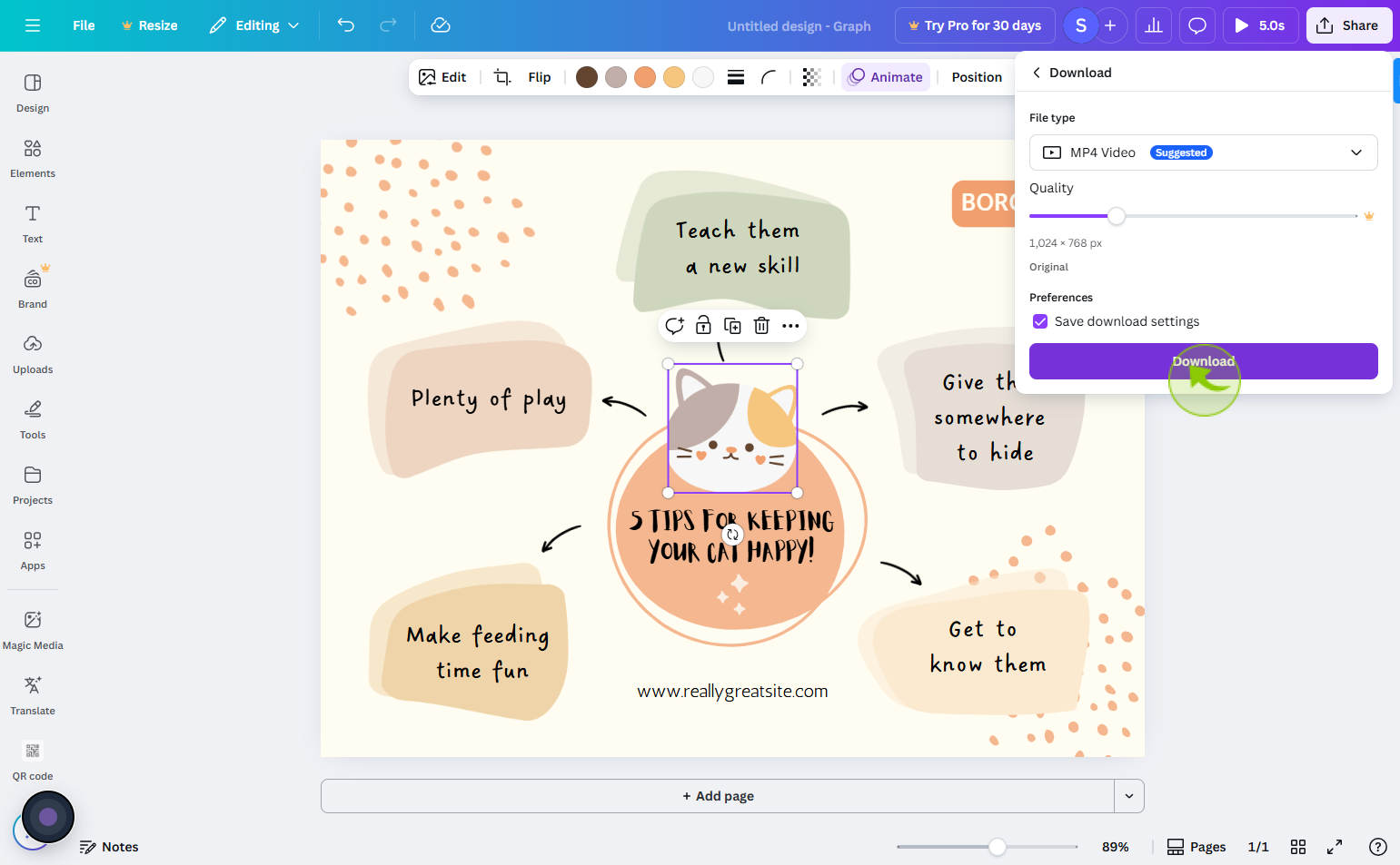
Click on the "Download"
You can share link or click on download

11
Click on the "Download"
Download or copy the link to share your design.